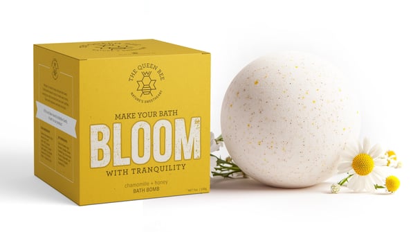
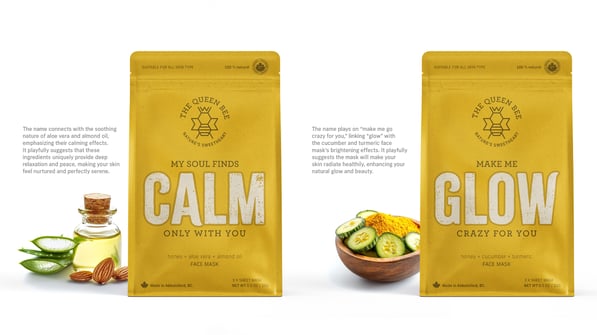
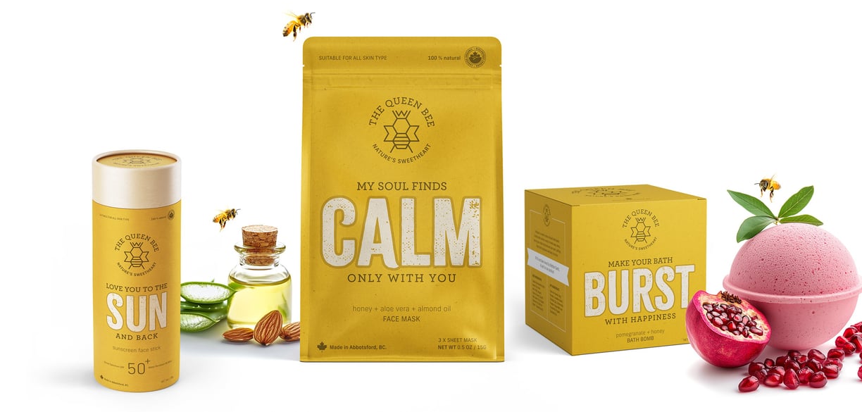
Typographic Love Notes for Self-Care
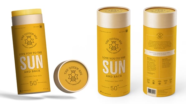
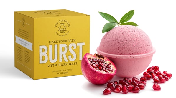
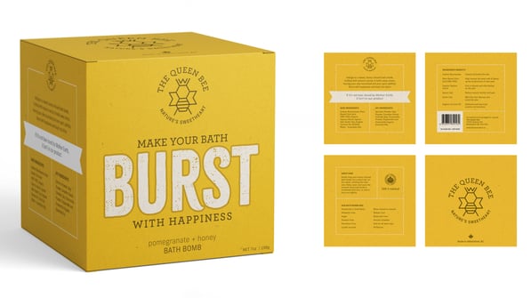
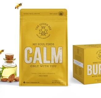
Infusing products with short, love-note-style affirmations creates a playful and heartfelt connection, transforming self-care into a delightful ritual. Fun, witty, and charming, each affirmation feels like a personal message. The duotone overprint design adds a minimal, sustainable aesthetic, perfectly echoing the brand’s eco-friendly essence.
THE QUEEN BEE
The Queen Bee is a cosmetic brand that infuses its product line with short, love-note-style affirmations that create a playful and heartfelt connection, turning self-care into a delightful ritual. Fun, witty, and charming, each affirmation feels like a personal message. The duotone overprint design adds a minimal, sustainable aesthetic, perfectly echoing the brand’s eco-friendly essence.
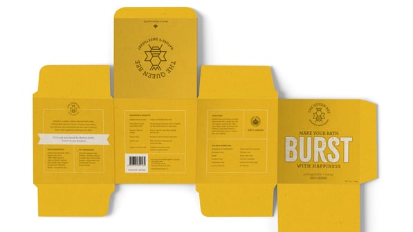
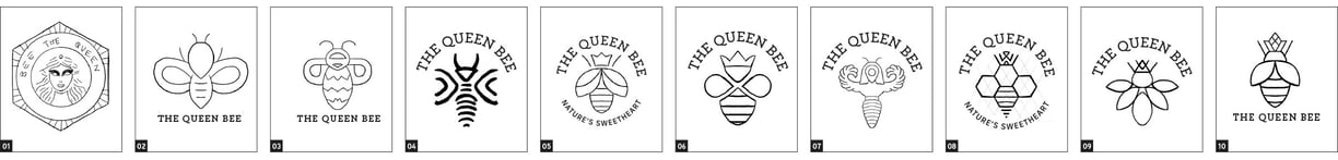
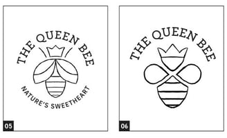
Logo Rationale + Process Work
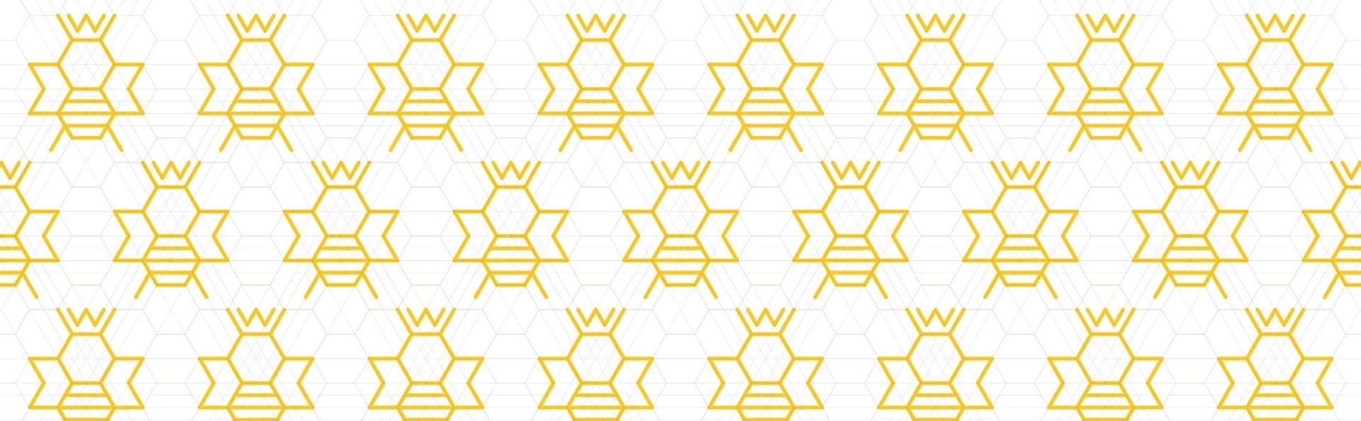
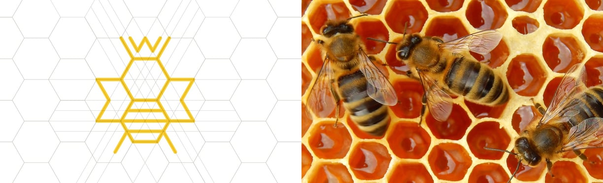
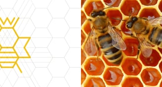
The bee illustration, designed using only hexagons and angular lines, embodies the precision and harmony of bee hives. This geometric simplicity highlights the brand’s dedication to natural beauty, sustainability, and the perfect balance inherent in nature’s design. The Queen Bee’s crown is subtly integrated into the hexagon grid.
Nazeem Junggee currently lives and works on the traditional territory of the xʷməθkʷəy̓əm (Musqueam), Sḵwx̱wú7mesh (Squamish), and səlilwətaɬ (Tsleil-Waututh) Nations.